Home Assistant

OPEN SOURCE

WEB

PROJECT PITCH

Design and evolve Home Assistant’s core experience so that a powerful, privacy‑first smart home platform feels approachable to both new and advanced users.

COMPANY

Open Home Foundation

ROLE & TEAM composition

Senior Product Designer
3x PM, 3x Product Designers, 4x Front-end

PERIOD

November 2024 - Currently

TOOLS

Lyssna

Google Forms

Code Editors *

Figma Make *

Figma

Protopie

RESPONSIBILITIES

  • Improving existing and building new functionalities based on project roadmap and user needs

  • Collaborated with the Open Source community to deliver features that fix user problems

  • Guided contributors Pull Requests with the last-mile of design or UX

  • Testing PR's for consistency and bugs

  • Reduced front-end technical debt by working with developers to migrate project UI libraries to Web Awesome

  • Evolving the MD2 based UI kit for better UX and a11y

  • Creating and analyzing surveys to get user feedback on existing features or get insights what and how to build next

  • Improving existing and building new functionalities based on project roadmap and user needs

  • Collaborated with the Open Source community to deliver features that fix user reported problems

  • Guided contributors Pull Requests with the last-mile of design or UX

  • Testing PR's for consistency and bugs

  • Reduced front-end technical debt by working with developers to migrate project UI libraries to Web Awesome

  • Evolving the MD2 based UI kit for better UX and a11y

  • Creating and analyzing surveys to get user feedback on existing features or get insights what and how to build next

DELIVERABLES

  • A new token‑based UI kit (base + semantic) aligned with Web Awesome and MD2 evolution

  • Starting a new Figma UI kit and coordinated migration from the legacy one, accommodating for the newest Figma features for developer hand-off

  • Research artifacts (surveys, synthesized findings) that informed IA and automation improvements

  • Production-ready Figma designs linked directly to GitHub PRs

  • Contributing small PRs addressing UI-related issues

HOW I USED AI ✨

  • Rapid prototyping: Generated interactive code prototypes with tools like Google Antigravity and Cursor to validate new IA and automation concepts within hours instead of days

  • Design exploration: Used generative tools to produce draft layouts and flows from structured specs, then refined them to match Home Assistant’s design language

  • Data Analysis: Synthesized large volumes of user feedback to identify patterns and inform feature improvements

  • Technical Fluency: Analyzed project repositories to understand UI logic and constraints, ensuring better integration between design and code

STATUS

ONGOING

HOME ASSISTANT DEMO

A note on metrics and privacy …

Because Home Assistant is a privacy-first platform, we do not track user behavior or collect invasive telemetry data. This makes standard quantitative metrics unavailable. Instead, I validated my designs through qualitative research—relying on interviews, targeted surveys and opt-in community feedback to drive the discovery and delivery phases of the design process.

Empathize

To understand how people really use Home Assistant, the focus here was on listening to different kinds of users. Their stories, questions, and frustrations helped reveal where the experience broke down and what problems were most important to solve first.

How and why

SYNCING WITH LEADERSHIP

I met weekly with the product leads to make sure my work didn't drift off course. This kept our fast one-month sprints focused on the long-term goals of the Open Home Foundation. Together we prioritized opportunities from research into concrete roadmap items for information architecture, automation, design‑system evolution, and other areas of Home Assistant.

How and why

INTERNAL TESTING

Our team uses Home Assistant to run their own homes. I grabbed their immediate feedback to catch awkward flows and edge cases before we ever released a feature to the public.

How and why

ASISKING FOR IDEAS

I sent out surveys with open-ended questions. Instead of forcing users to pick from a list, I let them explain exactly what they needed in their own words, which often revealed problems we hadn't thought of.

How and why

MONITORING FORUMS AND GITHUB

I kept a constant watch on our community forums and github repository to spot the most common complaints. This helped me prioritize fixing the things that actually frustrated users, rather than just guessing what they wanted.

How and why

AUDITING EXISTING UX

I reviewed our existing interface to find inconsistent or confusing patterns. This helped us clean up technical debt and make the platform feel like one cohesive product, rather than a mix of different styles.

How and why

SYNCING WITH LEADERSHIP

I met weekly with the product leads to make sure my work didn't drift off course. This kept our fast one-month sprints focused on the long-term goals of the Open Home Foundation. Together we prioritized opportunities from research into concrete roadmap items for information architecture, automation, design‑system evolution, and other areas of Home Assistant.

How and why

MONITORING FORUMS AND GITHUB

I kept a constant watch on our community forums and github repository to spot the most common complaints. This helped me prioritize fixing the things that actually frustrated users, rather than just guessing what they wanted.

How and why

INTERNAL TESTING

Our team uses Home Assistant to run their own homes. I grabbed their immediate feedback to catch awkward flows and edge cases before we ever released a feature to the public.

How and why

AUDITING EXISTING UX

I reviewed our existing interface to find inconsistent or confusing patterns. This helped us clean up technical debt and make the platform feel like one cohesive product, rather than a mix of different styles.

How and why

ASISKING FOR IDEAS

I sent out surveys with open-ended questions. Instead of forcing users to pick from a list, I let them explain exactly what they needed in their own words, which often revealed problems we hadn't thought of.

Define

While I continued to identify and ship quick wins, like dashboard tweaks and general usability fixes, the Empathize phase revealed deeper structural issues. While the wider team tackled other roadmap goals, I joined forces with a few colleagues and narrowed our focus to two critical areas and defined their problem statements:

Home Assistants' information architecture 🗃️

PROJECT PROBLEM STATEMENT

Surface and clean up the metadata of users' homes, overhauling when and how data is displayed.

Our goal was to ensure the interface provides the full context needed to make decisions, making the system speak "human," not just "machine."

To get user-validated insights, I've conducted a user survey published on Reddit. Among other questions that provided valuable insights on how to fix this problem, the question:
"If you rename devices in Home Assistant, what are your reasons for doing so?" gave the most insight on the scale and nature of the problem.

"At least 90% of my naming convention has been so I can tell where the device is that I’m working with on a dashboard, automation, blueprint, etc."

Survey respondent #1

"At least 90% of my naming convention has been so I can tell where the device is that I’m working with on a dashboard, automation, blueprint, etc."

Survey respondent #1

"My devices have their room as first part of their name because HA sadly doesn't have room 'namespaces'"

Survey respondent #2

"My devices have their room as first part of their name because HA sadly doesn't have room 'namespaces'"

Survey respondent #2

"For example i got multiple devices named mainlight. But cause i know the room, i know witch is witch"

Survey respondent #3

"For example i got multiple devices named mainlight. But cause i know the room, i know witch is witch"

Survey respondent #3

Most users rename their devices regularly, with the largest group (33%) doing so 'Sometimes' and a combined 60% stating they do so either 'Sometimes' or 'Often' (view source).

PAIN

Users are forced to rely on complex, manual naming conventions (hacks) just to locate their devices, because the system fails to group them logically or display the information that is already there.

When building a smart home, users dutifully input context, like floors, areas, and names, during setup. However, Home Assistant fails to surface this rich metadata in the interface later. This 'data silence' forces users to invent and maintain complex naming strategies and manual hacks just to distinguish their devices and restore the context the system is hiding.

CAUSE

Home Assistant does not show the necessariy context (meta data) for a given item to understand it's connections or relation to the physical device in the users home

The system suffers from a data disconnect: rich device metadata exists in the 'Settings' page but is not utilized in the actual user experience. When users perform high-value tasks, such as viewing dashboards or building automations, the system fails to leverage the data it already possesses, presenting a flat, context-free list instead of the rich information available in the admin view.

RELIEF

Bridge the context gap by surfacing hidden metadata, such as Floor, Area or Device name, directly in the interface. This ensures the system, not the user, provides the necessary context for every interaction.

Surfacing the already available data allows users to drastically reduce their server maintenance. This frees them to stop managing the database and focus on building and using their smart homes.

RELIEF

Bridge the context gap by surfacing hidden metadata, such as Floor, Area or Device name, directly in the interface.

This ensures the system, not the user, provides the necessary context for every interaction.
Surfacing the already available data allows users to drastically reduce their server maintenance. This frees them to stop managing the database and focus on building and using their smart homes.

IMPACT

After rolling out contextual info in over 7 key areas, users reported a better understanding of devices and their relations to other parts in their homes. This cut confusion, freed the team for evolve and work on the dashboarding experience, and continues improving the daily experience of using Home Assistant.

Automation engine 🤖

PROJECT PROBLEM STATEMENT

Align the automation engine’s learning curve with the evolving needs of our users. 

Based on in-depth analysis of one-on-one interviews with users who span different types of knowledge and backgrounds, the results of those interviews provided us with a list of opportunities aimed at solving the problem statement. One of which was to transform the way users perceive and use Triggers and Conditions.

PAIN

Trigger and condition system is overly technical and entity-centric, making it difficult for users to search for real-world concepts or automate based on broad scopes like areas, floors, and labels.

Furthermore, creating common automations is currently non-intuitive because it requires users to possess deep knowledge of internal state attributes and data flows rather than simple, device-centric behaviors.

CAUSE

The nauture of using a device entity as a trigger or condition made the entry point technical and not aligned with a more natural way of thinking of a chain of events that the user wanted to achieve.

Research shown that users also tend to think of an automation in a more scenario and natural way, and less procedural and technical.

RELIEF

Create a set of triggers and conditions that are modeled on a scenario or intent way of thinking

This significantly lowered the barrier of entry for non-technical users.

RELIEF

Create a set of triggers and conditions that are modeled on a scenario or intent way of thinking

This significantly lowered the barrier of entry for non-technical users.

IMPACT

After a 3-month rollout of UI improvements, including a dynamic sidebar that split automations into view/config modes and mobile-optimized patterns, usability scores improved significantly. Users now build and manage automations more intuitively with less cognitive load.

Ideate

With problems prioritized, I sketched out flows, automation patterns, and component updates using tools like Figma designs, Figma Make, and code experiments with agentic code editors - aimed at power users and newcomers alike, while working within our monthly release schedule. Narrowed ideas with PMs and engineers based on impact and fit. Documented what we'd tackle now, defer, or skip to stay focused.

How I've handled it

VALIDATING UX FOR AUTOMATION EDITOR

I created hi-fidelity prototypes to validate our designs internally before a single line of code was written. Once we shipped, I didn't just guess if it worked.

I ran standardized UMUX-Lite surveys after every release. The result? We scored an average of ~70% (Good), proving that our changes were actually solving user problems.

How I've handled it

OBJECT-ORIENTED UX MAPPING

I used Object-Oriented UX (OOUX) to map the hidden relationships between Entities, Devices, and Areas. This visualized exactly where context was missing and allowed us to break a complex architectural overhaul into small, manageable chunks for our monthly releases.

How I've handled it

RAPID PROTOTYPING

Static mockups weren't enough for this complexity. I used Figma Make to build real-world, data-rich prototypes instantly. This allowed developers to see exactly how the UI should handle "dummy data" edge cases, significantly cutting down the back-and-forth and helping them build a working version faster.

How I've handled it

VALIDATING UX FOR AUTOMATION EDITOR

I created hi-fidelity prototypes to validate our designs internally before a single line of code was written. Once we shipped, I didn't just guess if it worked.

I ran standardized UMUX-Lite surveys after every release. The result? We scored an average of ~70% (Good), proving that our changes were actually solving user problems.

How I've handled it

RAPID PROTOTYPING

Static mockups weren't enough for this complexity. I used Figma Make to build real-world, data-rich prototypes instantly. This allowed developers to see exactly how the UI should handle "dummy data" edge cases, significantly cutting down the back-and-forth and helping them build a working version faster.

How I've handled it

OBJECT-ORIENTED UX MAPPING

I used Object-Oriented UX (OOUX) to map the hidden relationships between Entities, Devices, and Areas. This visualized exactly where context was missing and allowed us to break a complex architectural overhaul into small, manageable chunks for our monthly releases.

Deliver

With concepts locked in, delivery meant shipping small, steady improvements to general usability, automations, and contextual info, also working tight with maintainers to avoid breaking setups or missing monthly releases. In open-source, this wasn't just handoff; I focused on clear documentation, quality checks, and guiding volunteer contributors to match design standards. This got real value to users faster while ensuring consistency.

How I've handled it

DESIGN QA

With dozens of unique contributors, I couldn't just design and walk away. I took on the role of a "Design Reviewer," actively testing Pull Requests (PRs) in VSCode and GitHub. I provided detailed feedback on spacing, interaction, and logic to ensure every volunteer contribution met our quality bar before merging.

How and why

POLISHING COMMUNITY CONTRIBUTIONS

I looked for great features submitted by volunteers (PRs) that matched our vision. I helped them refine the UI and UX of their code so we could ship their work to the wider user base.

How I've handled it

HANDOFF

To bridge the gap between Figma and GitHub and in the spirit of designing in the open, I stopped posting static pictures and started creating sharable Figma files that I directly linked to GitHub PRs, ensuring developers had exact token values, used component and logic flows, rather than just guessing from a mock-up.

How I've handled it

SYSTEMATIZATION

The platform relied on an aging Material Design 2 implementation. I led the migration to a modern token system (Web Awesome), replacing hard-coded values with semantic variables. This reduced redundancy and made it significantly easier for developers to build accessible, consistent features.

How I've handled it

DESIGN QA

With dozens of unique contributors, I couldn't just design and walk away. I took on the role of a "Design Reviewer," actively testing Pull Requests (PRs) in VSCode and GitHub. I provided detailed feedback on spacing, interaction, and logic to ensure every volunteer contribution met our quality bar before merging.

How I've handled it

HANDOFF

To bridge the gap between Figma and GitHub and in the spirit of designing in the open, I stopped posting static pictures and started creating sharable Figma files that I directly linked to GitHub PRs, ensuring developers had exact token values, used component and logic flows, rather than just guessing from a mock-up.

How I've handled it

SYSTEMATIZATION

The platform relied on an aging Material Design 2 implementation. I led the migration to a modern token system (Web Awesome), replacing hard-coded values with semantic variables. This reduced redundancy and made it significantly easier for developers to build accessible, consistent features.

How and why

POLISHING COMMUNITY CONTRIBUTIONS

I looked for great features submitted by volunteers (PRs) that matched our vision. I helped them refine the UI and UX of their code so we could ship their work to the wider user base.

dELIVER: TOKENS

Lead and introduced a two‑layer token system (base + semantic, for light and dark themes) aligned with the Web Awesome library, enabling theming and reducing hard‑coded values
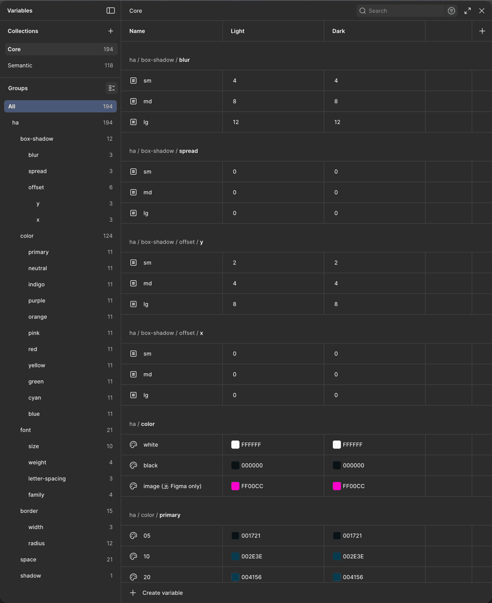
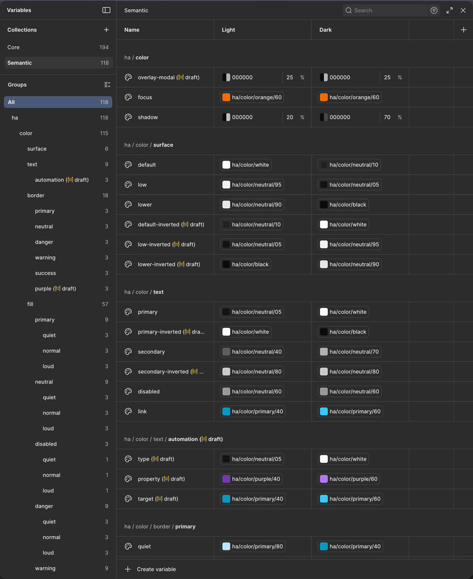
ha.color.fill.primary.loud

ha.color.fill.primary.loud

= ha.color.primary.30

=
core.purple.600

= #006787

=
#9822D4

IMPACT
  • Significantly reduced single-time usage of hard-coded values (DRY)

  • Made the work of developers simpler and reduced inconsistencies in the codebase

  • Laid groundwork for reusing tokens for other components

  • Introduced a systematized way of theming

DELIVER: UI KIT

Created and implemented a new UI kit based on new tokens and components
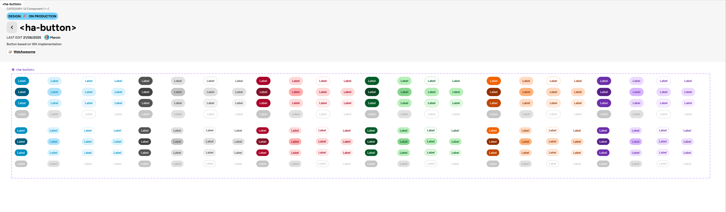
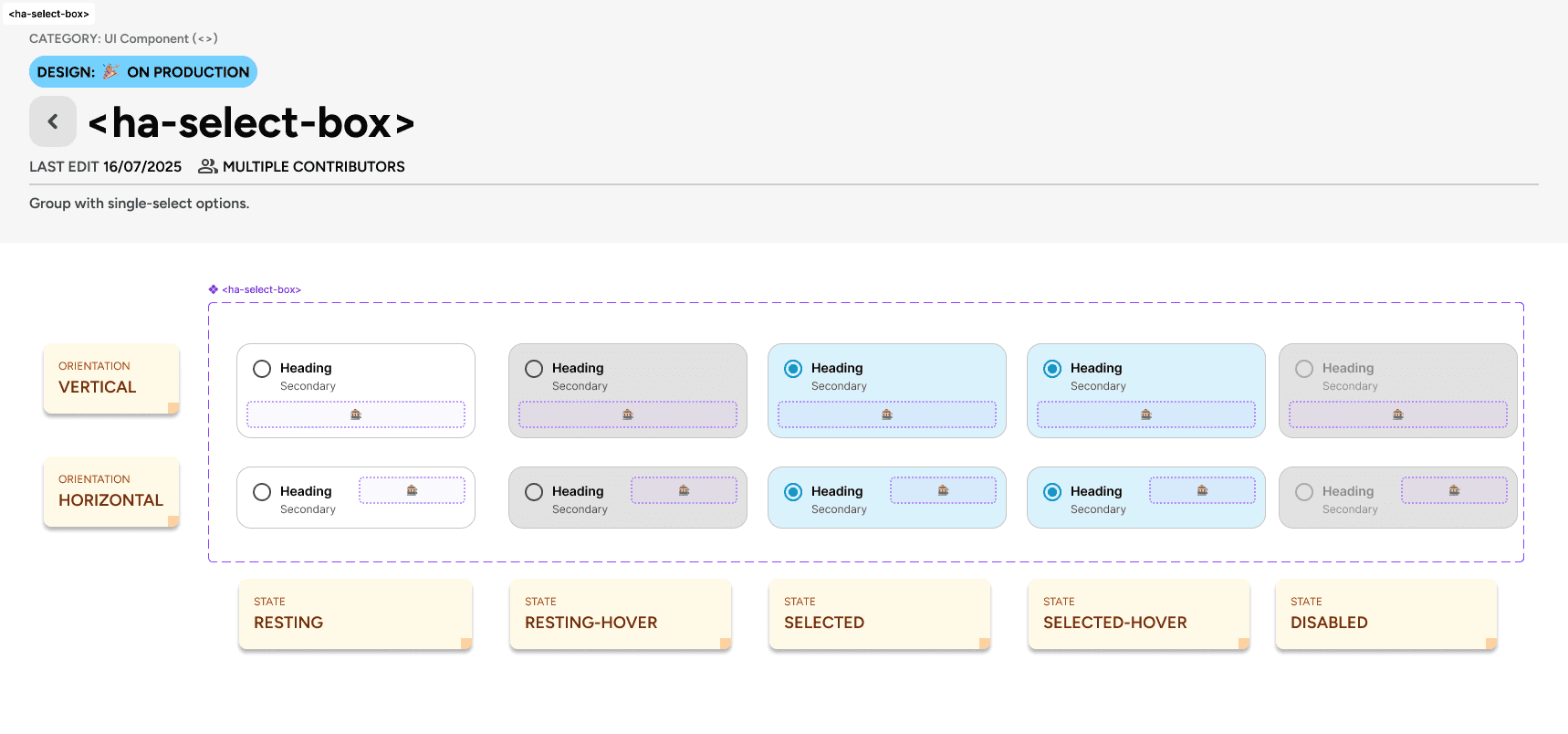
IMPACT
  • Introduction of new components improved the user-experience on desktop and mobile and helped in displaying information dense screens (i.e.: automation editor)

  • Using the "slot" method in Figma components removed the need to detach components from the library, making the design files more future-proof, and reduced maintenance for designers

DELIVER: CONTEXTUAL INFORMATION

Information architecture workstream

I designed and helped deliver contextual information across several key areas of the Home Assistant UI, providing the right details at the right moment to cut confusion.
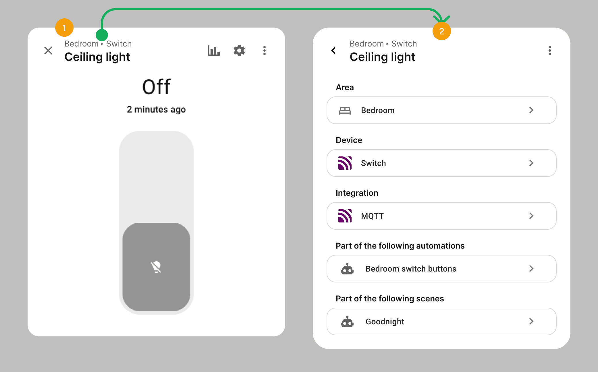
DESIGN GOALS

1

Display other relationships to the related item after clicking on the breadcrumb

1

Display other relationships to the related item after clicking on the breadcrumb

2

Display entity relationship to parent device, area and/or floor by the means of a breadcrumb component

2

Display entity relationship to parent device, area and/or floor by the means of a breadcrumb component

In the Home Assistant UI a user can select to get the data or point to different types of so-called "targets". In versions preceding my work, these UI pattern had some major downfalls in terms of accessibility, readability and clarity of information.
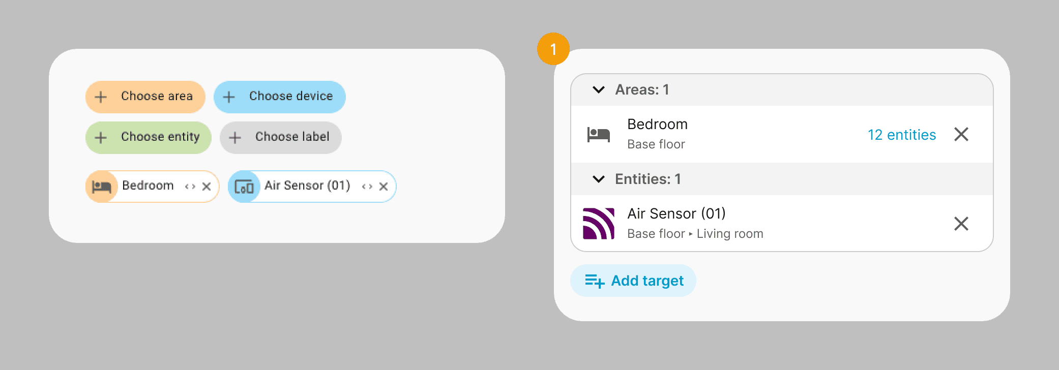
DESIGN GOALS

1

  • Display item relationship to parent device, area and/or floor

  • Progressive disclosure of information (by displaying of number of targeted children entities)

  • More readable and accessible list of selected items

  • Mobile-friendly and responsive

  • Grouping by type

1

  • Display item relationship to parent device, area and/or floor

  • Progressive disclosure of information (by displaying of number of targeted children entities)

  • More readable and accessible list of selected items

  • Mobile-friendly and responsive

  • Grouping by type

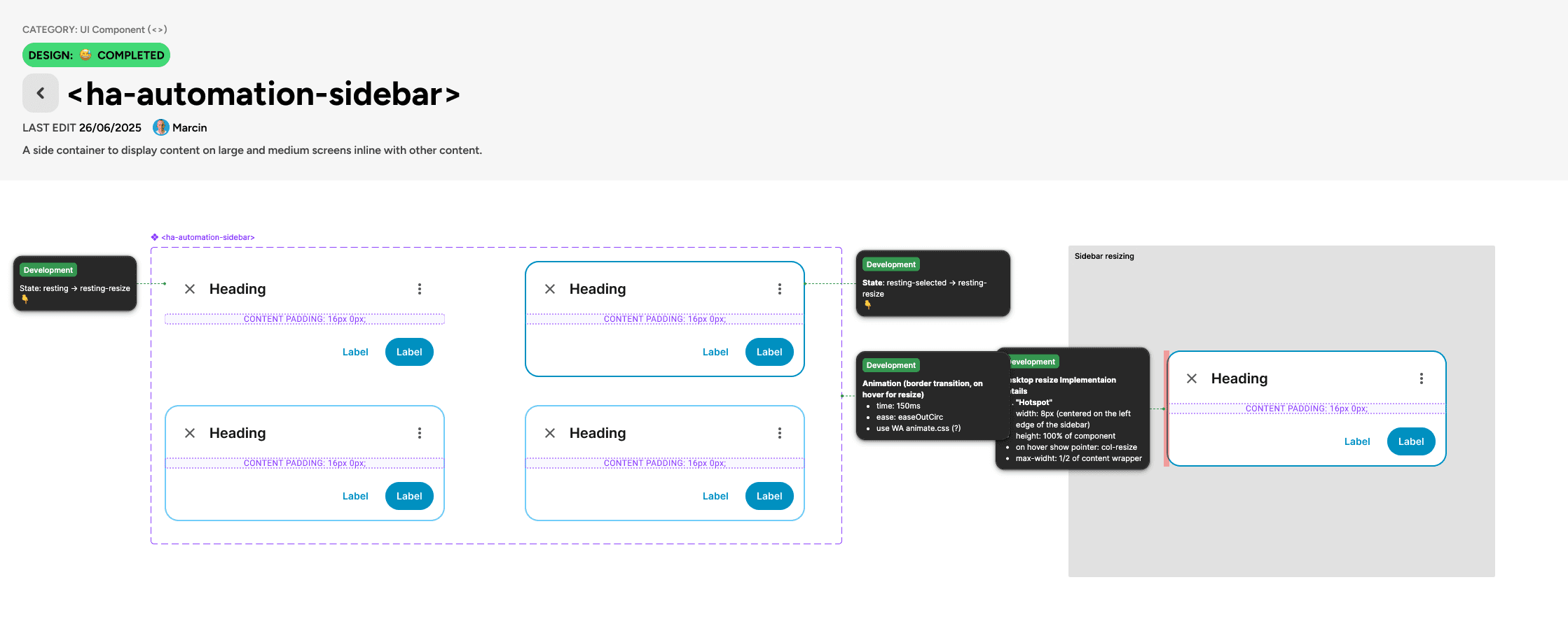
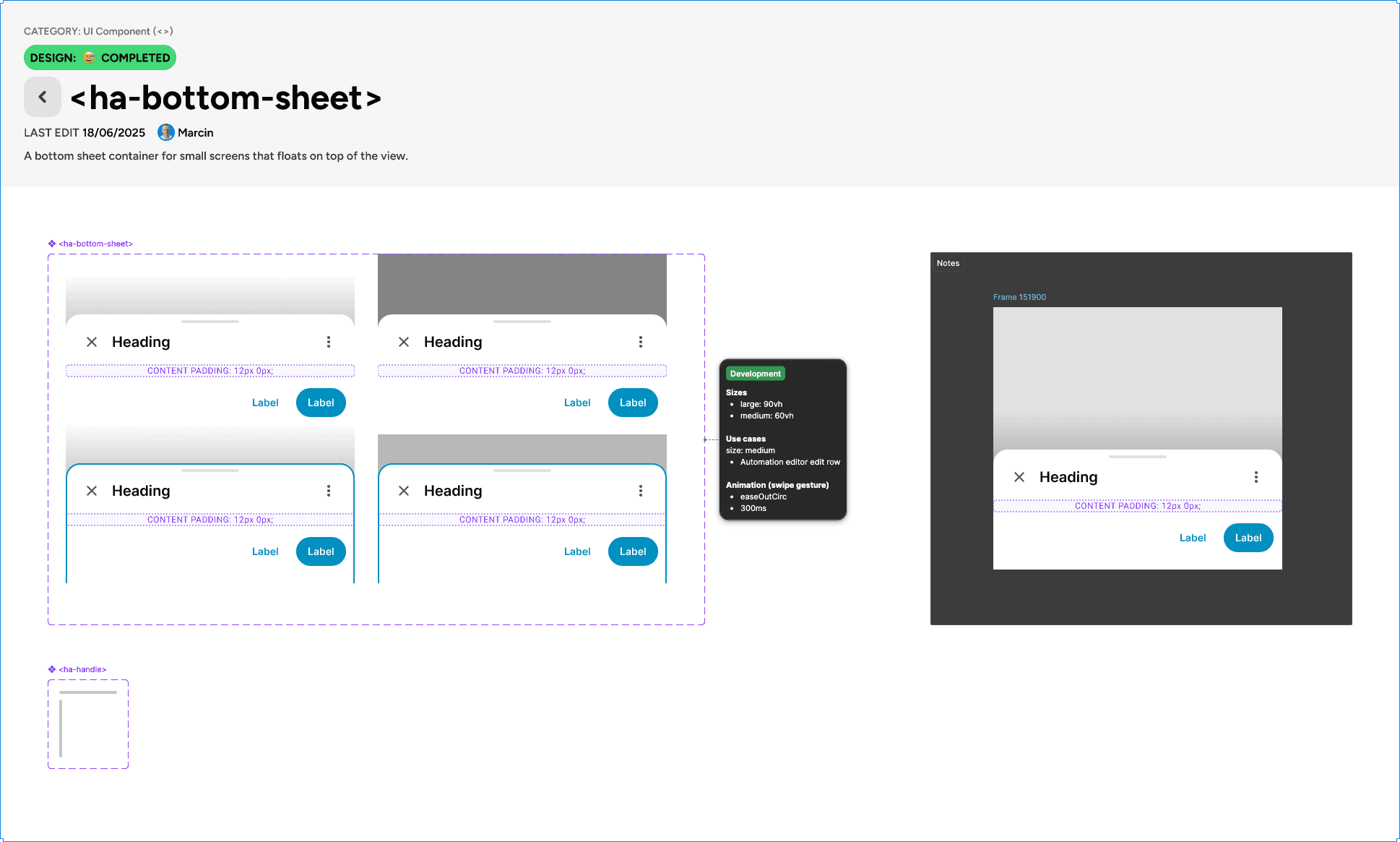
DELIVER: AUTOMATION EDITOR

Automation editor workstream

As noted in the define phase, the automation editor redesign also overhauled its visual layout - starting with a simplified list view for triggers, conditions, and actions (1).

Each row's configuration was then moved to a dynamic sidebar (2) that appears on demand, cutting information overload and cognitive load. Mobile-specific patterns, like a resizable bottom-sheet were also introduced to compensate for the lack of real estate on mobile to display all of the information.
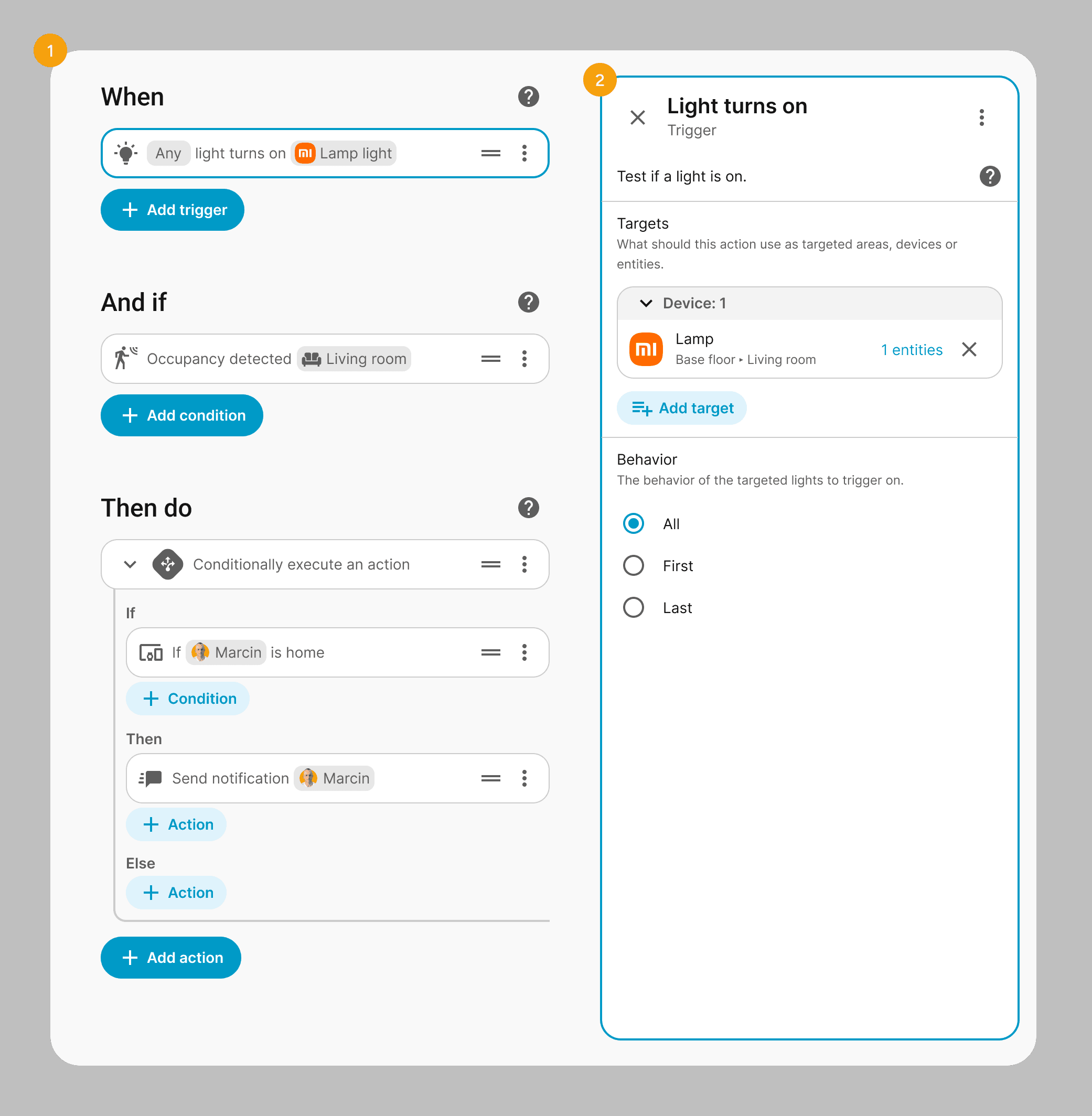
DESIGN GOALS

1

  • Improve readability by visually differentiating key values of a row item in a chip-style component

  • Reduce the "matrioszka effect" of nesting elements in elements by introducing simplified row indentations (inspired by code and text editors)

1

  • Improve readability by visually differentiating key values of a row item in a chip-style component

  • Reduce the "matrioszka effect" of nesting elements in elements by introducing simplified row indentations (inspired by code and text editors)

2

  • Reduce cognitive load by moving the configuration to a dynamic sidebar

2

  • Reduce cognitive load by moving the configuration to a dynamic sidebar

The second part of the work done by me has been devoted to creating a new type of triggers and conditions based on user intent, and not by a technical property of an entity.

To enable that the dialog for adding triggers and conditions has been completely re-worked from the ground up, to enable the user to browse by a tree view of the floor-area-device-entity hierarchy and show available triggers or conditions based on their currently selected child element.
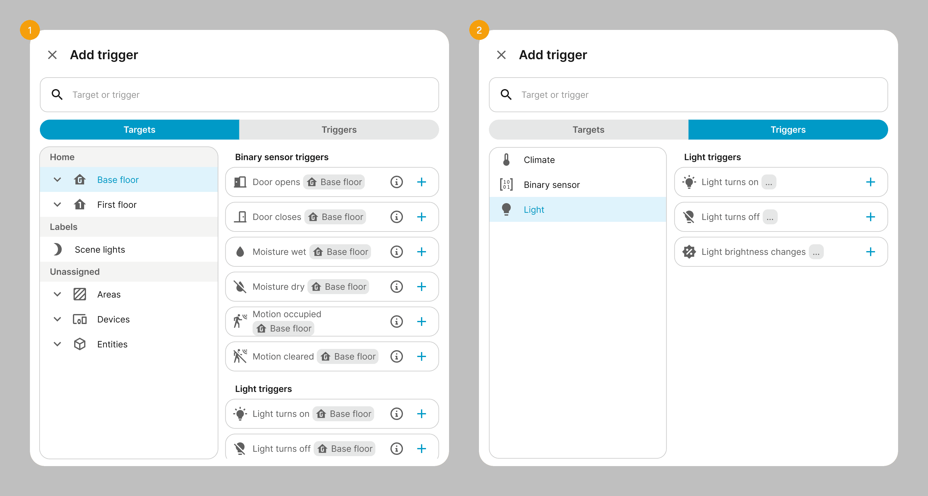
DESIGN GOALS

1

  • Provide a "target first" approach of building automations rather than by intent

  • Show relevant triggers, conditions, or actions that the user can add for any given selected floor, area, device or entity and/or child elements

  • Show a structured and hierarchical view of the whole home and its assigned devices to promote discoverability, or identify discrepancies in the physical-to-digital model of the users home

2

  • Provide a "intent" first approach of building automations that current Home Assistant users are accustomed to, but expand it with simplified triggers and conditions

2

  • Provide a "intent" first approach of building automations that current Home Assistant users are accustomed to, but expand it with simplified triggers and conditions

Challenges & Solutions

Transitioning into a large, legacy open‑source ecosystem meant designing for a global community rather than around it.​ The main challenge was modernizing the experience without blocking contributors or breaking existing setups.

How I've handled it

QUALITY CONTROL AT SCALE

With hundreds of unique contributors, maintaining UI consistency was difficult.

I shifted from being a sole designer to a 'Design Reviewer,' actively testing Pull Requests (PRs) in VSCode and GitHub. I provided detailed design feedback to contributors, ensuring their code met our quality standards before merging.

How I've handled it

TECHNICAL DEBT

The platform relied on an aging Material Design 2 implementation with accumulating technical debt.

I led the systematic evolution of the UI kit, introducing semantic tokens and upgrading components to improve accessibility (a11y) and minimize breaking changes in theming.

How I've handled it

THE COMPLEXITY CHALLANGE

Home Assistant is powerful but historically intimidating for new users.

To solve this, I launched user surveys to identify pain points for specific product areas and used AI tools (like Cursor and Figma Make) to rapidly prototype simplified flows. This allowed us to validate easier experiences without sacrificing the advanced control power users expect.

Key outcomes and impact of the team

ENGAGING THE COMMUNITY

🤝 47+ PRs with new features and improvements

Created and collaborated on PRs that improved usability, added functionalities and made Home Assistant more approachable for less techincal users.

INFORMATION ARCHITECTURE

🏷️ Easier naming and identification

Displaying the right meta-data in the right context reduced complexity and made identifying devices easier for users.

EVOLUTION OF CODE AND UI

🧹 Reduced redundant hard-coded values (DRY)

Implementing Web Awesome library and mapping new tokens helped developers ship faster and better coded features.

AUTOMATION EDITOR

🧠 A more intuitive, natural editor

A complete UI overhaul makes it easier to build on desktop and mobile. New intent-based triggers allow for a more human-like approach to automation.

ENGAGING THE COMMUNITY

🤝 47+ PRs with new features and improvements

Created and collaborated on PRs that improved usability, added functionalities and made Home Assistant more approachable for less techincal users.

EVOLUTION OF CODE AND UI

🧹 Reduced redundant hard-coded values (DRY)

Implementing Web Awesome library and mapping new tokens helped developers ship faster and better coded features.

INFORMATION ARCHITECTURE

🏷️ Easier naming and identification

Displaying the right meta-data in the right context reduced complexity and made identifying devices easier for users.

AUTOMATION EDITOR

🧠 A more intuitive, natural editor

A complete UI overhaul makes it easier to build on desktop and mobile. New intent-based triggers allow for a more human-like approach to automation.

Got questions?

Got questions?

Up next

Dialogue

PROJECT GOAL

Streamlines complex insurance processes for brokers and insurers

SaaS

WEB

Dialogue

PROJECT GOAL

Streamlines complex insurance processes for brokers and insurers

SaaS

WEB

marcinbauer.com © 2026

Last updated: 20.11.2025

Create a free website with Framer, the website builder loved by startups, designers and agencies.